
In this work I redesigned Israelbody ecommerce website in terms of Ux and Ui.
The main problems of the original website:
- Lack of branding.
- Not appealing.
- Too textual.
- overloaded with information and categories.
- The information architecture is not good and confusing.
Here is the original website:

Here is the upgraded website:

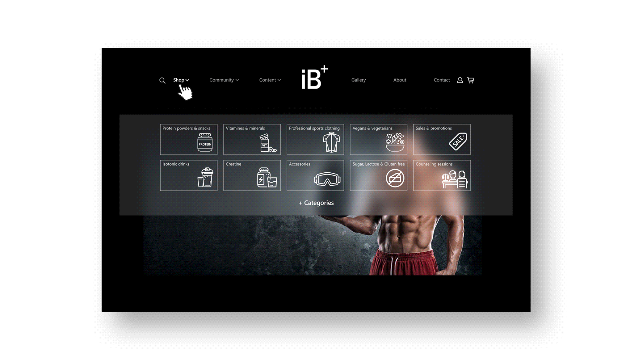
I decided to use mega menues:
Under 'Shop' I concentrated the major categories that make up 90% of all website sales. under 'Community' I organized the user's blogs, Forums and events. under 'Content' I placed all the textual information and video instructions.
I re-orgenized the products search resaults page:
Filtering is clearer and more accessible while I've reduced the number of options under 'Category' from 66 to 11 only.

The 5 guidelines for the App
